Saturday, April 30, 2011

A Zimoun Inspired Sculpture


I feel a lesson plan coming on.

Zimoun
The latest sound sculptures by Swiss artist Zimoun created in collaboration with Architect Hannes Zweifel at the Contemporary Art Museum in Bucharest, Romania

http://www.booooooom.com/2011/04/28/prepared-dc-motors-cardboard-boxes-sound-sculptures-by-zimoun-2/


Friday, April 29, 2011

Blog Design--Make a Button, Take a Button

If you read last week's post about grab buttons, then you may be wondering how to design and a button for your own blog.  It's really not too difficult.  I designed this button this morning in about 10 minutes.  I used   Photoshop today, but you can use any of the any photo editing program that you have.  The standard format size is 125 X 125 pixels, because that's a size that fits readily into most sidebars.  With that in mind, start creating.  Starting square in any size is a good place begin.  Choose an image and add some text.  And when you have a pleasing design resize and save as a JPG file to your computer.

To make the magic happen you first need to upload your image.  A super easy way to do this is to place your image anywhere in your blog.

Time to grab some code.  Find the code here and copy it (CTRL C)
Having done that, it's time to place the code in your sidebar.  In your blog, go to Design/Add a Gadget/Add HTML/JavaScript.
Paste the code into the text area.

Finally, add your own information into the areas of colored text and delete the instruction.

Hint:  
To find the web address for your image, click on the image you placed in your blog to bring it up in an isolated screen.  The URL is at the top of this page.  

That's all there is to it.  On your blog, hit SAVE.  and you're done.  

If you make a button, be sure to stop by and leave a comment so I can see your work!

Wednesday, April 27, 2011

The Very Awesome Dallas Clayton--More Free Stuff


You can read An Awesome Book of Thanks by clicking here.


Thank you, Dallas Clayton for sharing your beautiful books with kids.


Tuesday, April 26, 2011

Wow!

Fionna Banner at the Tate Museum.  Amazing.

http://video.google.com/videoplay?docid=5497825560179302354#
http://sciencetoymaker.org/plane/pattern2_09.PDF

"Seeing one of these planes overhead re-defines your perception of the three-dimentional space above. It even re-defines us: we are creatures living at the bottom of an ocean of air."

http://wings.avkids.com/Book/Wright/lesson2_p18991.html
http://www.pbs.org/saf/1103/teaching/teaching3.htm

Monday, April 25, 2011

Lets Draw Japanese Horses


I love the lively horses and collapsed perspective in this Japanese Circus Poster.                                                           


Saturday, April 23, 2011

How to Add a Grab Button to Your Sidebar

Every once in a while I get bored with my blog design and start tinkering with it.  This is a scary proposition because I've had the old design for nearly a year now and once things start changing, there's really no turning back. Goodbye old blog design. Been nice knowing you.  
As it turned out, I decided I just couldn't let go of the black background. So I added a new header.  And while I was at it I designed a grab button and added it to my sidebar. Don't know what a grab bar is? Like a blog roll, a grab button is a colorful way to link to your favorite blogs. It's a square badge with a little bit of computer code in a text box underneath it.
  
Here's how to add a grab button to your Blogger blog.


Locate the HTML code in the text box under the button in the sidebar. Copy it. (Ctrl C)
Go into your blog and click on the "design" tab.
Select Add Gadget
Select add HTML/Javascript
Paste code (Ctrl V) in the text field
Hit Save 


The link will appear in your sidebar.  That's all there is to it.  You're ready start sharing the link love. 

More Clay Chimes


Spring time is clay time, and why should kids have all the fun?
I made a lot more clay beads and added some cookie cutter shapes into the mix.  The beads and charms will be strung into musical hanging chimes. I used low-fire white clay that I had on hand and bisque fired to cone 04 to drive the moisture out. Here's everything ready to be glazed.  
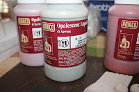
Glazing all those pieces is a big job. To make light of it I hosted a glazing party at the house and invited friends and family to stop by and help glaze. It was fun glazing and visiting around the kitchen table and by the end of the day everything was glazed and ready to be packed back to the kilm glazed with Amaco Opalescent Liquid Glazes. It is the first time I've use these glazes and I'm really excited to see how they turn out.  
Here are some glazed beads drying on skewers. 

Friday, April 22, 2011

Glazing Clay Beads--

I made up a lot of clay beads while the kids were working on their chimes and would like to try glazing them. I've never done this before.  Perhaps you can help.  
My plan is to glaze them, avoiding the hole, and then string them onto 18 gauge Nichochrome wire.  I'll suspend the wire between shelf blocks in the kiln making sure to leave a space between each bead.  Then I'll let it rip.  
If all goes well the beads will be used in an upcoming fundraiser.
Does anyone have any ideas or suggestions concerning glazing and firing beads?  Suggested glazes, etc.  They will be used to benefit Kiva.  Check out what they're doing                

Thursday, April 21, 2011

Clay Chimes and Hanging Garden Sculptures

This month Currier students are building clay bells for the garden.

We made up a lot these...pinch pots and beads.  
To stay organized, we dried and fired the beads right in the pinch pots.

Paint your pots and add a final coat of clear gloss to weather proof.

We string our beads and pots onto a cord so they don't get mixed up while they dry or in between coats, and add a masking tape label with our name.   

Arrange your beads and bells.  Secure each addition in place with an overhand knot.
Hang and enjoy.
Helpful Hint:  Little kids can mold their pots in silicone cupcake forms (just like clay cupcakes).

Art Show 2011


Wednesday, April 20, 2011

Chihuly: Through the Looking Glass

If your plans include a trip to Boston anytime in the near future; you're in for a real treat.  The Boston Museum of Fine Arts is hosting the exhibition Chihuly: Through the Looking Glass. Seemingly, Through the Looking Glass is an apt name for the exhibit.  According to a very dear friend (who just returned from a trip to Florida where she took in the Chihuly Museum), this is a must-see show.  The interplay of light, dark, color, reflection, space, and glass make for a visual experience that becomes otherworldly.  Completely mind blowing are the words she used to describe the Chihuly Museum.  And I'm all for that!
Information about the exhibit and a short video of Chihuly glass (useful if you're working on one of those wonderful Chihuly Lesson plans that are floating around the web) are posted on the Boston Museum of Fine Arts website.  You can watch the video and get details here.
If you planning to stay in Boston and would like a lead on a place to stay, check out the Buckminster Hotel.  It's a Sanford White building with a view of Fenway Park.  The Buckminster is within walking distance and/or T travel to the museum, the aquarium, Chinatown, Little Italy, etc.
See you there!

My Blog Button

I Photoshopped a button for my blog today.

Monday, April 18, 2011

Paper Swing--Another Art Room Freebee


I had a why-didn't-I-think-of-that moment when I saw this because it looks so simple.  It's called the Paper Swing, and it's used to dispense rolled paper.  The paper swing was developed by a Swedish design company that specializes in children and child development.  It resulted from watching children drawing activities in a kindergarten room where kids were drawing on large sheets of paper.  So much fun for the kids, economical for the classroom.  But doling out the paper is not so convenient, and the kids can't help themselves.  Add a dowel and a rope and the problem is solved.  According to the description, the swing hangs stable on the table by the weight of the paper alone where it is ready when needed and easily accessible.  Tiang Tang is sharing the design for free and you can see the details by clicking here .  
Kind of reminds me of the way paper is rolled out in the doctor's office.  Makes me want to try it just to see how it works.  I have a drill.  I know I can find a dowel and a piece of clothesline.  I already have the rolled paper.  So this project really is free.  

Friday, April 15, 2011

Zen Eggs for You

If you've got a sharpie pen and an egg you can make a zen doodle egg like these.  I saw this on Alisa Burke's Blog and am reposting it for all the Zentanglers and Doodlers out there (you know who you are).  These doodles are made on blown out white eggs, but I suppose you could do them on hard cooked eggs and color them as well.   

Thursday, April 14, 2011

Free Download at Foldschool

My two favorite words in the English language "free stuff".  I love it.  I cannot pass by the free box at anyone's tag sale without peeking in.  Truth is, I've found some very cool things in free boxes over the years, but this post makes me want to spill out the stuff and take the box, because even better than free stuff,  is free stuff you can make with and for kids. 
Nicola Enrico Staubli is the Swiss-based designer behind Foldschool  furniture.  His design philosophy is to move design back to what he consider's its original mission:  to provide a product at an affordable price through a smart manufacturing process, and by jove, I think he's done it.    Foldschool has posted three FREE downloadable patterns for modern folded cardboard furniture.  Let the kids loose with the paint and they will have a personal piece of furniture handmade by you.  What's not to love?  When the child has out grown the furniture, dispose of the cardboard with clear conscience.  

Friday, April 8, 2011

Beautiful Vision: The World of Takashi Shuji


I'm posting this today, because I find it so inspiring.
"Takashi Shuji, 35, who has Down syndrome, works with pastels as a member of a painting club at Mukogawa Suzukake Sagyojo, a facility for disabled people in Nishinomiya, Hyogo Prefecture.
Shuji's work, characterized by bold outlines and filled, at a frenetic pace, with pastel hues, is often completed in a single, unstinting effort of many hours, often leaving his face blackened. One of his pieces was used as part of the promotional poster for the Art Brut Collection Japon exhibition held at the same Lausanne gallery last year."(From The Daily Yomiuri)